Five Tricks to Expand your Space
For those of us dwelling in cities, living on a block of beautiful victorian terraces, or even living the rural life in a charming little cottage, small rooms are somewhat a fact of life. That is not to say that bigger is better; there is a lot to love from these bijoux spaces. But when your space is on the smaller side you might want to try a few of our five tips and tricks to give it the illusion of size. How you control light, sight lines, colour, balance and proportion affect how big a space is perceived, and when done correctly can give your small rooms a bit of ‘big room energy’.

1. Let the Light Flow
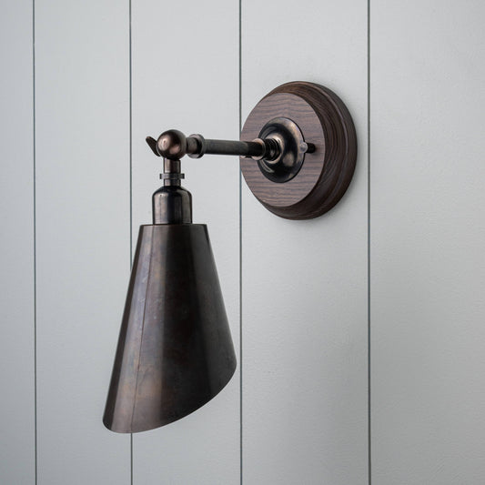
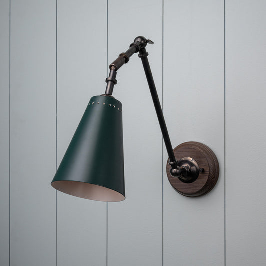
A bright and well lit space feels open and unconstrained and creates a sense of decompression. Unfortunately the nature of small rooms means there is less provision of natural light. In these spaces natural light is a premium and should be protected or enhanced. Avoid large, heavy curtains and instead go for sheers or privacy blinds, and keep the area around the windows as clear as possible. Mirrors and light surfaces multiply the amount of light moving around a room. To compensate for a lack of natural light, using lots of layered lighting can dispel the shadows and eliminate dark corners. Compact wall lighting, such as our favourite Stitch In Time wall light, radiates light inward from the edges of the room, and practical small table lights can be utilised to dot little pools of light everywhere, like our Ditsy lamps - small enough to light up the dark nooks of a shelf.

2. Be Strategic with Colour
We would never tell you to white-wash a room, but it is important to recognise the impact of lighter colours on the walls and ceiling at expanding the room. Instead, we suggest to just avoid darker tones in small rooms, and to reduce the difference of colour contrasts. A more monochromatic palette brings the room together, rather than greatly contrasted palettes that can have the effect of visually breaking up a small room into even smaller parts or putting too much emphasis on the elements of the interior that suggest division such as the walls. You should want the space to read as continuous, with a deceptive sense of depth. If you are going to use white, apply it to the ceiling to give the room height without compromising the personality of the rest of your colourful interior.

3. Keep the Sightlines Open
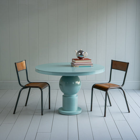
Dark colours, shadows, and objects can interrupt the flow of a room making it appear more divided up. This can work to your favour in a large space by making it feel less empty, but for a small space it has the effect of feeling overwhelmed and cluttered. With fewer interrupted sightlines the space becomes more continuous with a reduced sense of division, and creates the perception of more open space. To achieve this it is important to keep windows and entrance ways clear of bulky furniture, and limit the number of pieces sitting in free space. Arrange furniture and upholstery with a bit of structure rather than dotting them around randomly to reduce the eclectic chaos, and choose raised pieces where possible to open up the space beneath them. Our Bits and Bobs bedside with it’s elegant legs keeping it off the ground, or our Revive side table with its light and open structure are both perfect examples of furniture that can work in this way.

4. A Matter of Proportion
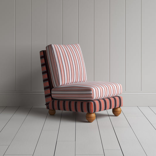
The seemingly obvious response to furnishing a small room is to use small furniture, however this doesn’t always work to your advantage. Counterintuitively, many small pieces can over-crowd an interior and without clear hierarchy appear disjointed. One or two larger pieces help to anchor the room. One of the easiest mistakes to make is to keep filling the space with more, when actually more restraint helps the cohesion and builds a far more intentional interior.

5. Go Vertical
By directing the eye up it is possible to expand the apparent volume of the space and create an illusion of height. Vertical shelving is a clear and easy way to achieve this, but there are more techniques you can employ. Simply positioning artwork a little higher, or stacking artwork with multiple images above each other is a nice way to suggest height while simultaneously adding more personality and identity to your room. Despite some peoples fears, a four poster bed can work brilliantly in a small room for this very same reason. Our Out for the Count and our Folly beds with their slender posts give vertical lines that draw the eye towards the ceiling. If you are not quite ready to commit to the statement or scale of a four poster, a three-quarter poster can have a similar (if not slightly dialled back) effect.

Mini Space Mistakes...
Alongside providing you with our top five tips to make a room feel bigger we wanted to give a little word of warning to prevent you making these few common mistakes when designing your tiny interiors:
- Back up against the wall - for the few inches of space you gain pushing sofas and tables neatly against a wall, you lose a bit of the rooms flow. Keep about a fist of distance between furniture and the edges of the room to make a room feel less boxy
- Small rugs - you should always go as big as you dare with your rugs. Larger rugs pull the different pieces in a room together and prevent the room being broken up into fractioned smaller spaces
- The dreaded overheads - overhead lighting casts a lot of shadows and drowns the room in an uninteresting wash of light. Those shadows break up the interior and fill the airy gaps beneath your furniture with blocks of darkness. A combination of wall lights, picture lights, task lighting and table lights can dispel the gloom and lighten your space